Versatile Type Design for the Web
ATypI (the International Typography Association) held its 60th annual conference in Warsaw (Poland) last month. A great opportunity to broach the subject of versatile type design for the web.
ATypI (the International Typography Association) held its 60th annual conference in Warsaw (Poland) last month. A great opportunity for Louis Rémi Babé, CTO and Cofounder of Prototypo, to broach the subject of versatile type design for the web. For those who missed it, here’s a look back on its talk.
A revolution is coming up
So far, type design has put all the power in the hands of the type designer, and limited power in the hands of the graphic designer. Type designers start with a blank page and a pen, while most graphic designers are only free to choose a family and then pick a variant. Even in the case of super-families, only the type designer chooses the granularity and range of available variants.
But there are two obvious reasons why this paradigm is about to change.
Giving control back to users
The first reason is that we’ve all felt a real frustration amongst graphic designers to be only consumers of fonts. They want the ability to customize fonts, to tailor them to their work and make them unique.
Adapting fonts to their context
The second reason is that digital typefaces are used on devices that come in a lot of different shapes and sizes, and can be used in many different ways. We need fonts that one can send somewhere in the cloud, forget about, and that will automatically adapt to their context when they’re being read.
Interpolated fonts & Parametric fonts
There are different technologies that make this revolution finally possible, and we’ll focus on two font technologies that are likely to play a significant role here. They’re not particularly new, but they are getting easier to use.
Interpolated fonts
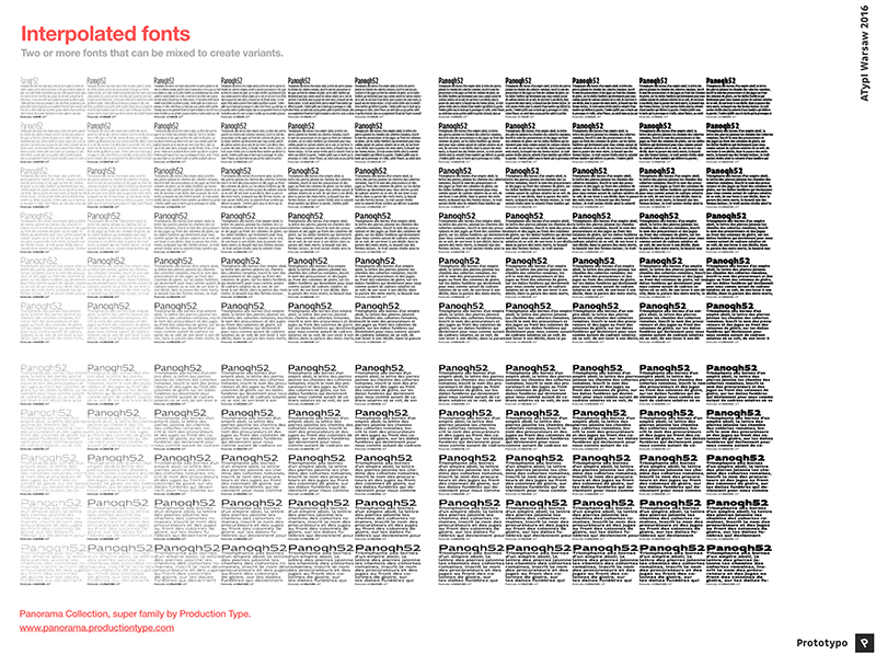
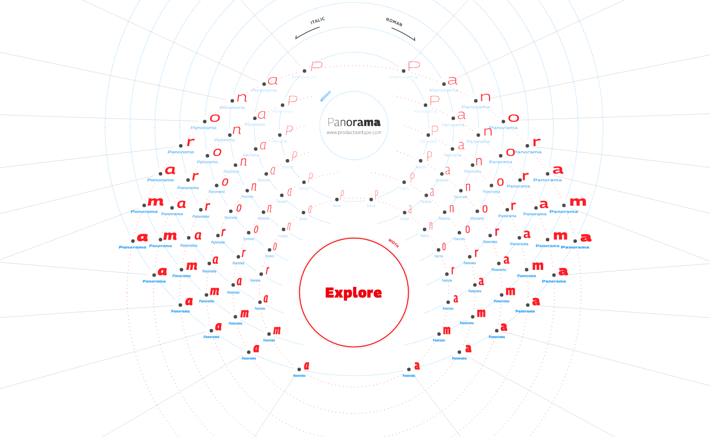
As you might know, interpolated fonts (we should say interpolatable font sets) designate two or more fonts that have been specially constructed so that a program could mix them and create intermediary variants.
You might already be familiar with Prepolator and Superpolator to build interpolated fonts.
Parametric fonts
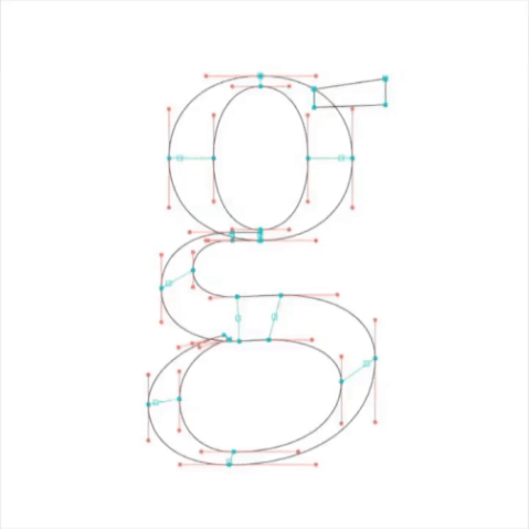
A parametric font is an algorithmically generated font. “Algorithm” is very much a buzz word these days. In any context you hear this word, it’s important to remember that it just means “a recipe written for a computer”. A parametric font is the recipe of a font, with its mandatory list of ingredients. But for each ingredient, the quantity is left up to you.
Now, when you start following the recipe of a banana bread, you can be pretty sure that, no matter how much you mess up the quantities, you’ll never end up with a chicken curry soup. Same goes for a parametric font: it’s a recipe for a certain kind of fonts, not for any font.
The history of parametric fonts could be the subject of an entire talk, so we won’t detail it, but you might have heard of MetaFont, fontChameleon, Infinifont, FlexFont, Kalliculator, MetaFlop, Metapolator, or Prototypo.
Comparison
How do those technologies compare to each others?
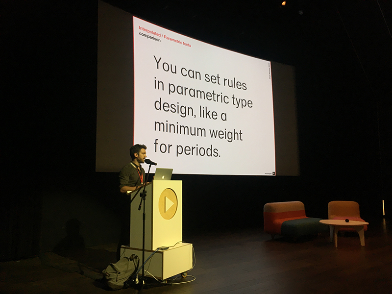
The main advantage of Interpolated fonts is that they can be produced with the tools and knowledge that type designers already possess. You have to respect certain rules though. Basically: you have to draw the font once for each interpolation axis you want, a glyph must have the same number of points in all masters, and use the same contour directions in all masters. Not only you need to draw many masters, but every time you want to make a stylistic change to your font, you have to adjust many variants.
With parametric fonts, you only have to care about a single master. Instead of following typographic rules to draw the different masters, your job is to express those rules using code, and let the computer follow them. So every time you modify the recipe, all variants are affected. That’s the biggest advantage of parametric fonts, but it also means that you have to take care of potential side effects of every modification.
Another benefit of parametric typefaces is that they’re easier to build as components, and some of those components (such as serifs, diacritics and punctuation) can easily be reused across typefaces.
Horizon
Interpolated fonts and parametric fonts will play a key part in the upcoming font revolution because they have all the characteristics to be adapted, by the graphic designer, or to their context.
And they can both be compiled down to variable fonts format. Variable fonts are basically an official format for interpolated fonts, but the good news is that we also can convert a parametric font to variable fonts format, without loosing too much adaptability. So it’s another key piece of technology that will bring interpolated fonts and parametric fonts to the masses in the foreseeable future.
The web makes the future tangible now
The final piece of technology in this revolution is, we believe, the web. Web browsers are omnipotent and ubiquitous technological wonders. They are present on many devices, and can do a lot of things:
They can display content (images, videos, and of course text)
They can manipulate this content pretty much any way they want: thanks to OpenType.js and other libraries you can now parse a font directly in the browser, or generate one and display it. Modern browsers are fast enough to animate fonts.
They have access to all sensors available on modern devices to give context to the content: what is the size of the screen, what is the ambient luminosity, how far is the reader from the screen, where on earth is he, etc.
This opens up a lot of possibilities, as you can see with these few demos:
More experiments on Prototypo's Lab:
Parametric font challenges
At Prototypo, we believe parametric type design has the potential to save a lot of time to type designers.
This is why we are investing a lot of energy into our parametric font technologies.
We have already tried numerous approaches to parametric font construction:
- Fonts built using a custom programming language (like in MetaFont)
- Outlines drawn from parametric contours
- Outlines drawn from parametric skeleton and pen
- Using bezier curves
- Using Hobby curves (the curves used in MetaFont)
- Etc.
What we’ve learned, doing all of these experiments, is that parametric type design is possible, but that there is an unsolvable equation between freedom of creation and ease of use. The easier a type design tool is to use, the less freedom it gives to the creator. You have to balance the two, and there isn’t always a good solution and a bad solution. Sometimes all there is, is a choice.
This is why we are building tools to help type designers create parametric fonts that give more choice to the type designer on how they build this recipe.
Prototypo Builder
And the most important effort we’re doing in this direction is Prototypo Builder.
It’s a tool that tries to reconcile the importance of logic and algebra without which parametric type design isn’t possible, with the necessity of having visual tools, without which type designers couldn’t approach this innovation.
The tool is under development, we will come back to you soon with fresh news.
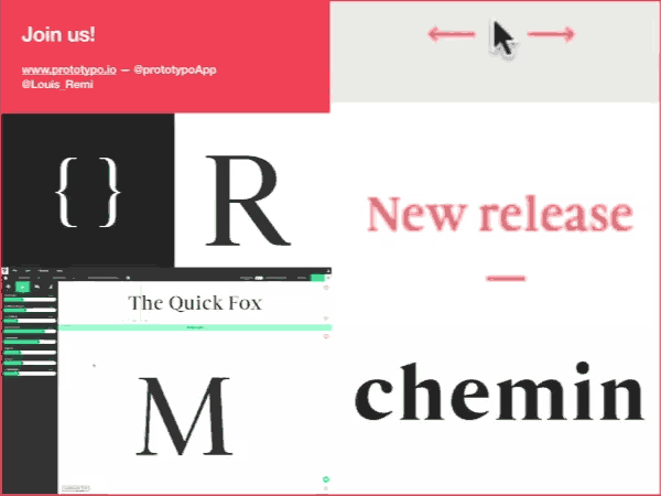
Join us!
We’re looking for type designers willing to give parametric font creation a try. So if you’re interested by the subject, we encourage you join the revolution, and get in touch with us on Twitter, Facebook or by email at contact@prototypo.io
Cheers, Louis-Rémi