Prototypo gives itself a makeover!
If you’ve been on Prototypo the last few days, you may have seen that things look a little different.
Here we are, our new user interface has come! Clearer, more functional and hopefully to your taste… We tell you all!
A cooperation with web usability experts
Since the public launch in October 2015, the application is constantly improving with new features and new parametric fonts. Among these enhancements, we always had in mind to simplify the use of the software. Why? We knew that Prototypo’s interface had much room for improvement and that a reshaping of the first version was essential.
To assist us in this tough task, we secured the services of a specialist in user experience (UX), the Stash agency. For nearly 10 years, Stash has shared its expertise with big brands such as HP or Dior.
Their original idea was to see the application in the hands of users to gather feedback and observe how they use it. The aim was to identify the navigation issues and to determine axis of improvement.
With this in mind we formed a panel of users composed of graphic designers, web designers, artistic directors, working as freelancer or in web/print agencies.
These testers have then used Prototypo during one hour sessions, trying to complete predefined objectives. Some basics tasks like creating a new font family with variants, individualizing groups of glyphs or exporting a font to Glyphr Studio. Of course you knew those features, didn’t you?
In addition to observe the testers, Stash filmed them in order to watch in detail their behavior and habits of use.
This testing stage was part of a complete audit of the application. A comprehensive analysis which allowed these UI/UX experts to highlight key usability issues and gave us a set of solutions to overcome them.
Your feedback counts
Aside of the expert advices of Stash and test users comments, our reflection has been guided by your precious feedback. You are now more than 10,000 users and we are committed to sharing daily with you.
Thanks to this privileged relationship, we have collected many reviews on your experiences of Prototypo. Each comment allowed us to build an application that hopefully will match your needs.
What’s new
It appeared that most users were able to quickly understand how the app worked and use it to create their first font. However, managing the font library and using more advanced features deserved a serious makeover. Here are some of the enhancements you may have already noticed.
Simplifying your experience
First of all, we wanted to make the project creation step simpler:
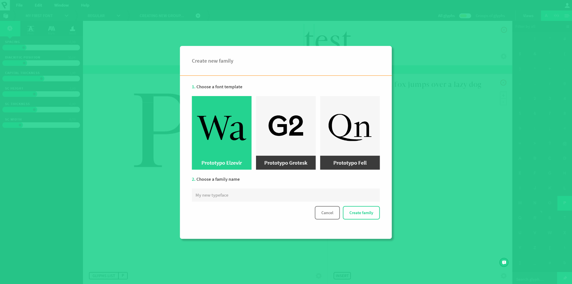
Displayed at the top left, the header menu is easier to reach. The new project creation process is more logical: choose your template (the choice is highlighted in green), type the name of your new font, that’s all, you can customize your font family!
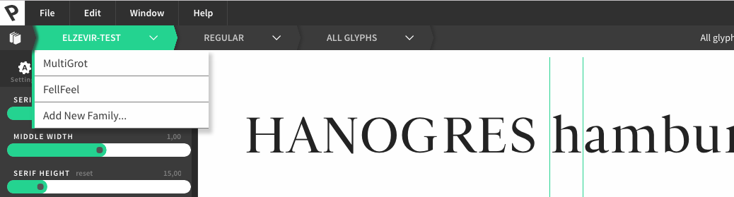
Managing many projects could cause confusion for users, that’s why we added a breadcrumb menu to the application. It provides an overview of the font project, from the family down to the details (macro to micro), so you can clearly identify the font you are working on, and easily switch from a project to another.
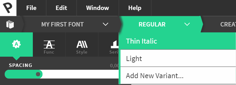
Variants creation and edition could be confusing, even be a blocking factor for some users, so we have completely redesigned it. This function is now accessible from the breadcrumb menu, by clicking on the name of the variant you are editing.
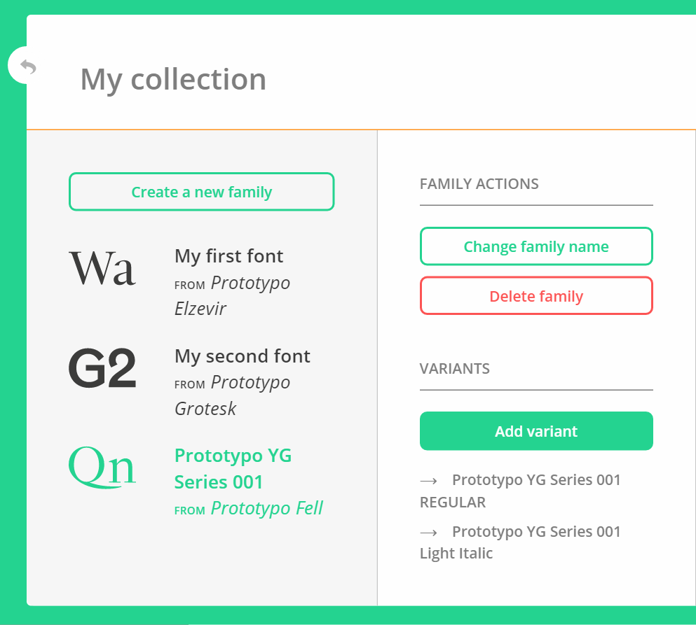
The variant is reachable from the collection menu as well.
Hightlighting advanced features
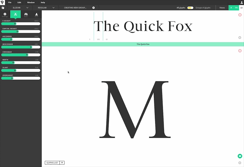
Did you know that you were able to individualize glyphs or groups of glyph? If this major feature has been hidden for a while, now it’s clearly visible. You can reach it via the breadcrumb menu or with a switcher at the top right of your screen.
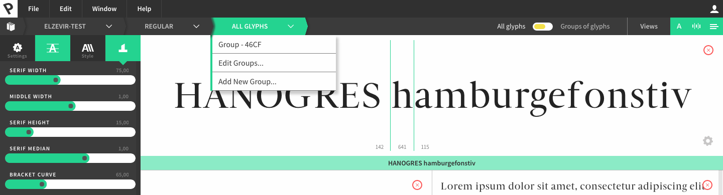
The individualization area is much better identified through its own color scheme (yellow = group of glyphs, green = all glyphs).
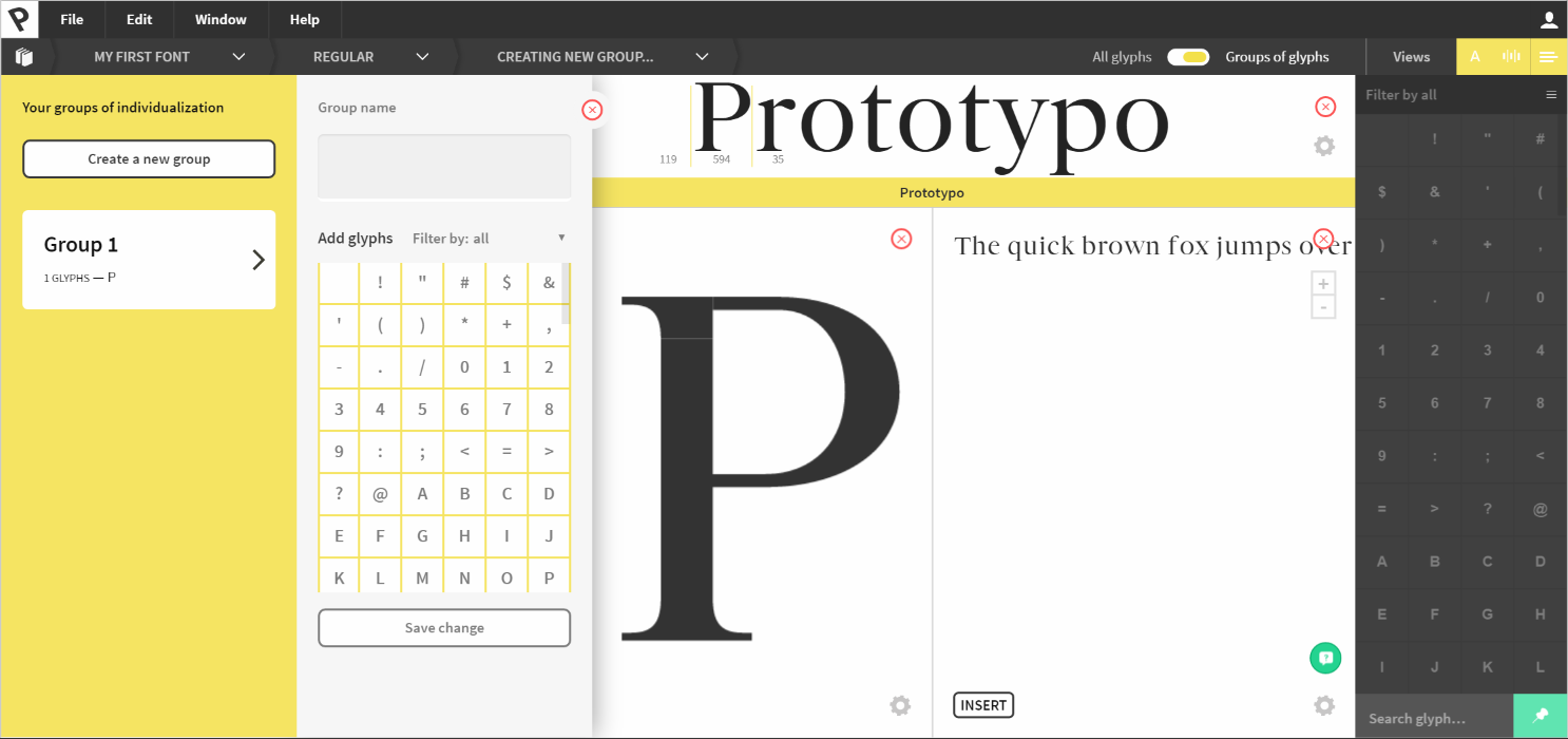
Group of glyphs creation has also been simplified, you just have to name the group, then choose the glyphs that make it up, and finally click “Open in Prototypo” to modify your characters.
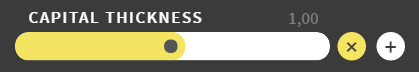
There are two ways to modify your individualization parameters. The proportional individualization (x) will multiply the current value of your parameters by your individualization value. The second mode is absolute (+) which will add or subtract the value of your individualization parameter to your global parameters.
The font collection management has been clarified too.
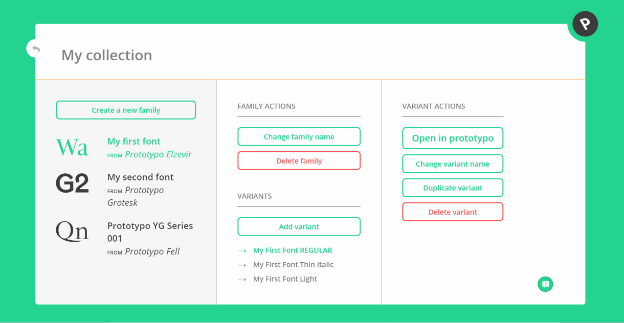
The different options for your font family are more identifiables thanks to a drawer menu in which they are sorted by categories. Note that from this interface you can now download either an entire family or just a variant. Another important addition, the possibility to change the family name.
All these changes may appear disturbing to the regular Prototypo users. Do not panic! We kept the overall functioning of the application, including sliders simple to use and accessible from their menu on the left of your screen. The display of the different views of your font project has remained the same. If you have any issue you can contact us through the in app chat.
Spacing management
As you may already know, spacing plays an important role in the quality of a font. We started by adding a slider in the new "settings" tab which is close to a letter-spacing setting. This parameter allows you to give more or less space between letters within your whole design. Spacing should also be managed individually, that’s why we have created a specific view for it where you can manually adjust the spacing for each sign.
It’s your turn! Log in to the application and discover the new Prototypo. Any comments? Contact us, we love to chat with our users.
Cheers!