Prototypo user: Anatole (Trainee at Prototypo). The floor is yours!
Anatole spent 6 weeks using Prototypo. We asked him a few questions.
Some of his answers could be affected by the fact we haven’t rated his internship report yet. Considering that, it was still cool to see how a young designer uses Prototypo for real!
Hi Anatole, can you introduce yourself?
Anatole, I’m 19. I study graphic design in Paris. I’ve completed my end-of-year internship at Prototypo. After my studies, I’d like to be a professional type designer. I mostly learn overall graphic design but I have some lessons about the history of typography and workshops with type designers. This graphic design program gives me the opportunity to learn how to use a font in the right way.
Have you already drawn fonts before Prototypo?
I’ve created some, mostly modular fonts. I also customized existing fonts for a student project. I tried to create one from scratch but the work is far from over!
When you’re not a professional type designer you spend a huge time on details, especially to refine the curves
Why did you chose modular fonts?
That was the simplest way to create a font! That kind of font requires less knowledge in type design. When you’re not a professional type designer you spend a huge time on details, especially to refine the curves. You spend hours on basics that are not automatic for a non-specialist.
How did you know Prototypo? What was your impression when you first used it?
I knew Prototypo before I applied for my internship. I discovered it in a post on Pointypo.com. I tried the free version, which was frustrating because I only had a few parameters. That still allowed me to feel the potential of the tool. My first impression on the full version? Well, I’ve been tempted by all these sliders. The UI is friendly so I played with Prototypo as if it was a toy.
Prototypo saves a lot of time, it automates the repetitive tasks
And after practising a little?
I became aware of how powerful was the software when I started a real font project. I got the most out of Prototypo, using all the features, especially the parameters individualisation which allows to create a very unique font. From a funny app I jumped to an efficient tool which fits a specific need and could become an essential step in a font project. I wish I had this tool for my previous projects. In a very short time, you get a prototype that materializes an idea.
You’ve created some fonts during the past 6 weeks. What has been your creative process?
I never threw myself directly on the font editors. First I needed to look for inspiration. It might be by browsing the web, some books or magazines. Everything surrounding me could be an inspiration.
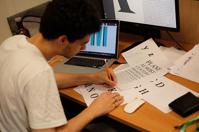
Second, I set my ideas on paper. It’s important to draw models by hand even if it’s not perfect, it represents a first materialization of my reflection.
Prototypo was the third step. I started trying each parametric font to see which one suited my idea the most . Prototypo represents a solid creation basis. It allowed me to outline the shape of my font. Once I had something close to my idea, I exported my font to refine it in a typeface editor. Prototypo saves a lot of time, it automates repetitive tasks and get 75% of the job done. It’s way easier to refine the letters after, you just clean the font you have exported. You fix some curves, you harmonize it. Basically I only had to redraw 2 or 3 letters from scratch because I wanted a very special shape, something different from the 3 basic templates in Prototypo.
Could you tell us about your font projects during your traineeship?
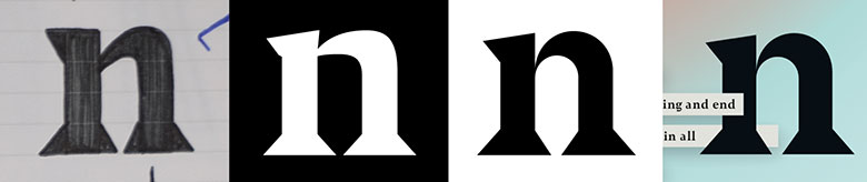
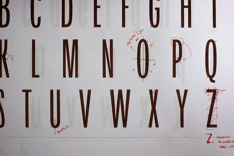
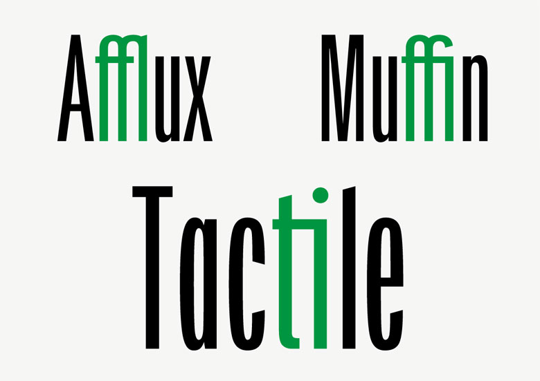
Among some projects, I prototyped 2 fonts, strictly different from each other. The first one is based on the Prototypo Elzevir template. The aestheticism of the curves matched what I wanted to do. My first goal was to create a type with good curves, readable, a bit classic, but with cuts in it, to make it more unconventional. As we moved forward in the project I drifted to something more usual but we kept the « sharp » serifs. I had to make several adjustments but the basis and the skeleton of each letters remained the same, except for two letters that are completely different compared to what I’ve exported from Prototypo. I’m talking about the “a” and the “g”.
And the second one?
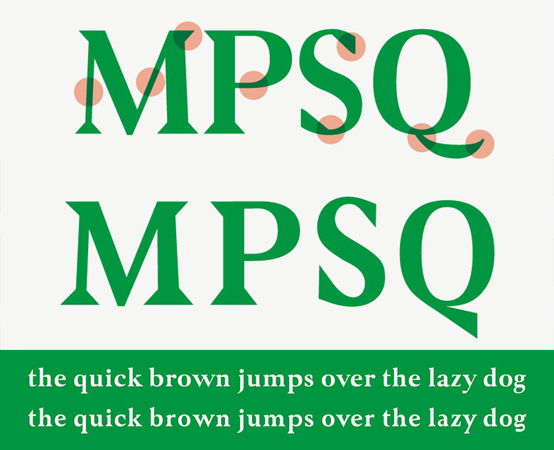
The second one is radically different. First of all, it’s a typeface that is mostly for titling. It’s a condensed sans serif based on Prototypo Grotesk, which features minimum contrasts and very thin spacing. Because I already went through Prototypo, it was easier and faster to create this second typeface. This time I fully took advantage of the individualisation feature, which allowed me to export a much cleaner font. This basis saved me a lot of time during the “manual adjustment” phase: I mostly had to tweak the spacing and clean some curves. Once again, I spent more time on a few letters (the “k” and “y”) to alter the identity of the font.
Which additional features would you like to see in Prototypo?
The ability to tweak spacing would be great. That’s a long and hard work to get something clean [we’re adding spacing sliders to the next version of Prototypo, Ed,]. The ability to move the bézier curves would be cool as well. This would save more time after the export.
Prototypo is for people who are not professional type designers but who love to experiment some of their type ideas
What advice would you give to the Prototypo users?
I would tell users to take Prototypo seriously, to realize how helpful it could be for their font project if they’re not professional type designers.
A word to conclude?
Prototypo is for people who are not professional type designers but who love to experiment some of their type ideas. It’s a huge time saver for those who need a unique font for a project or want to lay down on paper some type sketchs. I’ll definitely tell my teachers about Prototypo! That could simplify the learning of typography and its use, make it more fun! Some people could see Prototypo as a gadget, they play with it without any goal. After using it for 6 weeks I see it as a powerful tool which could be included in every font creation process.
We told you he wouldn’t be that objective, but we promise, we did not threaten him!
Download the posters of the Prototypo AC Series 001 and Prototypo AC Series 002!