A year in review
As Prototypo celebrates the first anniversary of its commercial launch, it’s time for us to take stock of this busy year and look forward to the next steps.
An ongoing improvement
Prototypo has quite evolved since October 2015. Let’s have a look back on the main achievements during this year.
First of all, we have been pleased to welcome Prototypo Elzevir, the latest brainchild of our partners and friends from Production Type.
At this time, Prototypo Elzevir was our most complete parametric font thanks to the experience accumulated on the first 2 templates. They have since also been updated and are fully functional too!
Also new this year, you may have heard about Prototypo’s Web Preview Extension. This Chrome extension lets you preview your font on any website. Thanks to this tool, all the changes you make in Prototypo can be applied immediately on your website. The real plus is that you can now preview your fonts together in their final environment.
Still haven’t tried it? Here is the way it works!
A brand new user interface
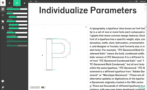
The release of our brand new user interface has been another big step forward. It has been a long process from the usability tests to the integration, but the result was worth it.
The new interface is much more functional, with some major options more recognizable. Glyphs individualization and variants management are for instance way easier to use.
This makeover of Prototypo came along with new features, like spacing management, which was missing from the app so far.
We continue to collect your feedback constantly in order to improve the interface that we know can always be better.
A growing community
You are now more than 15,000 users coming from over 130 countries! A great community of designers and typography lovers around the world with whom we communicate every day.
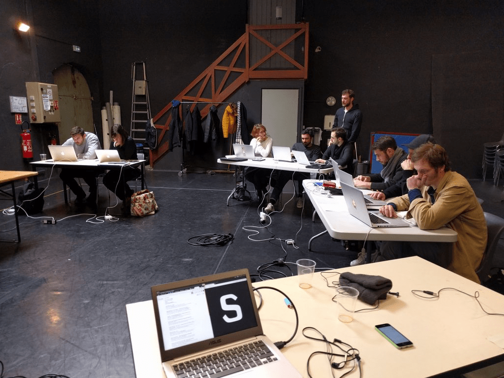
We took advantage of this year to meet you through different workshops and talks.
Letters Are My Friends, Mirage Festival, Typo Berlin, ANRT Nancy, ATypI Warsaw 2016, several events during which we tried to explore the limits of Prototypo, and imagine what the parametric typography could be tomorrow (you can have a look at some experiments in the lab).
Want to experiment with prototypo.js? Turn your original font into a parametric one? Or set a digital installation working with our technologies? Just tell us, we’re always up for original experiences!
What’s next?
This permanent contact with the community allows us to steadily improve the application and to work on the features you need. Here are some revelations about what you can expect in the next months.
We can already tell you that manual edition on glyphs will be the next big thing.
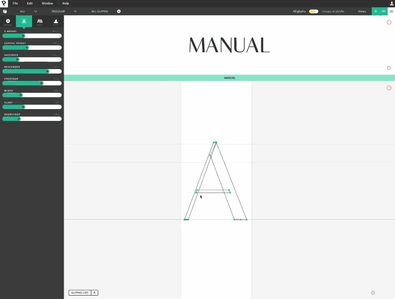
Many of you asked for this for such a long time, it will be a reality in the coming weeks!
With the manual edition feature you'll be able to change the position, distribution, width and angle of every node in our templates and create the font you truly wanted, with no restriction.
Build your own parametric fonts
Another huge addition to come is the Prototypo Parametric Font Builder.
This visual tool will allow you to create your own parametric fonts point by point. You’ll then be able to use your creation in Prototypo just as you do today with our 3 templates.
This builder is under development and will be released early 2017.
Among still other things to come, we can announce that a new font powered by Production Type will be on the menu in the next months. A fourth template meaning another range of possibilities for your type designs!
What kind of font do you expect? A geometric sans serif? A humanist? Tell us on Facebook and Twitter!
As you can see in the animation below, we are working on the control of glyph components.
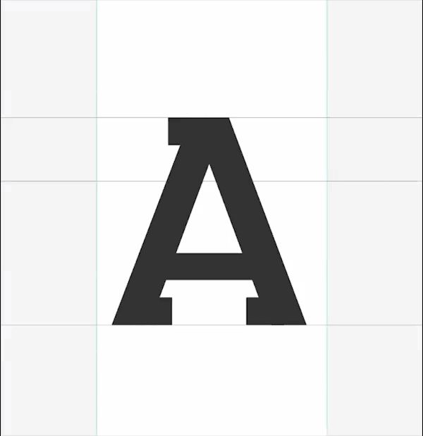
Keeping a half of a serif or tweaking its shape could be the right moves for your logo design. Or maybe not? At least you will be able to easily try by switching all the built-in components!
These coming enhancements are part of a global aim which is to grant a maximum freedom to users. By increasing the degree of customization in Prototypo, we want you to express your creativity without limit.
Prototypo was built to let people create unique fonts and experiment ideas as quickly as possible so they can just focus on overall design.
Now go ahead and try the app! We are eager to read your thoughts. Twitter, Facebook, email, contact us. We love to chat with our users!
The Team,
Cheers!