Prototypo’s v2 is online!
A year after it’s commercial launch, we’re glad to introduce Prototypo’s v2. A new version of the software that aims to give you even more freedom in your creations.
A few weeks ago we celebrated the first anniversary of Prototypo. A first year during which we improved the app and worked on making it as functional as possible, in order to let designers create their own fonts in the simplest way.
The project began in June 2009, and stemmed from my personal frustrations as a graphic design student at Arts Décoratifs Strasbourg. I fiddled around with typefaces for my student projects and for my first commissions as a freelance designer. Typography being a basic component of a graphic identity, my inexperience at mastering this essential skill of the creative industry was a real hindrance to me.
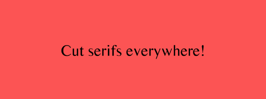
Lacking both time and experience, I began modifying existing fonts like many young graphic designers: slightly amending a curve, deleting parts of serifs, and creating hybrid fonts. But the results were always a bit shaky.
I knew this kind of work was often forbidden by font licenses, but it was my personal craving for typographic creativity that caused most of my dissatisfaction with the result. These fonts didn’t belong to me, and I wanted to create my own.
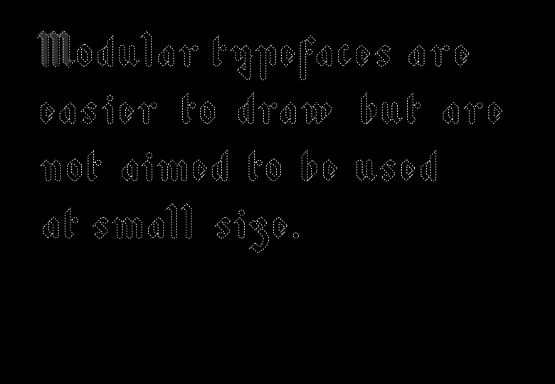
There was a solution to my frustration: drawing my own parametric typefaces, by combining together stems, loops, and other simple shapes that I already mastered. You find yourself caught up in the game, you build letters one after the other, you add modules, you expand your shape library. Words quickly take shape, and the letters are yours. Then it’s time to design something else than titles or logos with these very geometrical shapes, hardly adapted to long texts or small composition sizes…
Many times I told myself: “I want to draw my own entire alphabet. I want it to be original, with some graphic qualities, as well as being readable and optimized”. All I ended up with was a folder full of font files with fancy names, and containing only a handful of characters.
I had ideas, though. I just lacked a solid basis of theoretical and practical drawing skills. The whole concept of Prototypo was born from the simple observation that an alphabet could be defined as a system of shapes, and that it was possible to code this system.
A few years later, after many sleepless nights, liters of coffee and, most of all, some great encounters, we finally built Prototypo: an application to prototype ideas, that can model as many typefaces as you want from a template created by professional type designers.
For a year we offered an export to GlyphR Studio, an open source tool that lets users manually edit bézier curves in the browser. This provided an interesting second level of customization for advanced users, but there was no way to go back to the parametric level, should users want to make another global change. Even if typeface design is a matter of going back-and-forth between drawing and printing proofs, it is obviously much better if you don’t have to constantly start the same work over.
We have therefore sought to give more freedom to the user within Prototypo, while keeping the parametric aspect, which is the backbone of our tool.
V2! 🎉🎉🎉
Today we release a major feature of Prototypo: it is now possible to manually modify the nodes of each skeleton. By integrating this additional level of control, we want to answer the needs of our most demanding users.
What does it mean in concrete terms? From now on, you’re free to change a node, a curve or a whole part of a letter. Each node has several characteristics that allows you to imitate the way lettering with pen and paper works (see G. Noordzij, “The Stroke: Theory of writing”): the position of the brush, its angle, its pressure as well as the distribution of the weight around the skeleton.
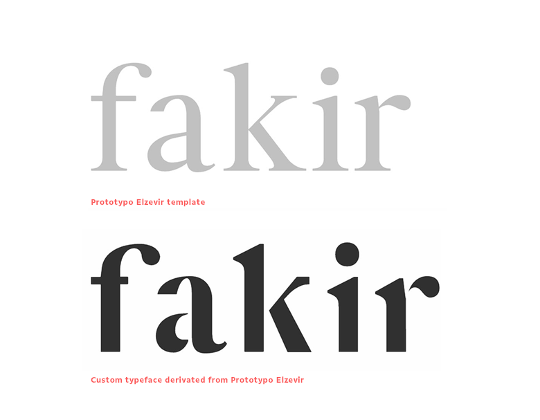
This major change in the application enables users to rectify small imperfections that the templates can produce when sliders are pushed to the extremes:
You can create a fully functional font in Prototypo without using any other software.
But that's not all: with this change, Prototypo enters a new dimension as it is now possible to transform any glyph without being limited by what the template initially offers.
The v2 of Prototypo also includes the control of glyph components.. As shown on the animation below, this feature will let you switch all the built-in components of a glyph.
When you design a graphic identity, the lettering for a logo used to be the first step and it seemed logical to turn this lettering into a complete font to apply the new identity on a wide range of documents and products.
That is where we want to bring Prototypo: an application that can guide users throughout all the steps of the creation of typographic identities, from the first glyph to the entire font.
According to you, which feature is still missing from Prototypo so that it can become a tool you might want to use everyday? Tell us in the comments or on Facebook and Twitter!
Yannick,
founder & Art Director of Prototypo.