LSTK Dayfly - A font in a day by Constantin Demner
Create a font in just 24 hours, is that reasonable? Constantin, a graphic designer from Vienna, set himself this challenge. He tells us his story.
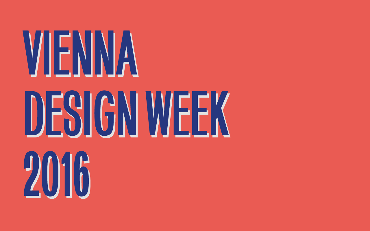
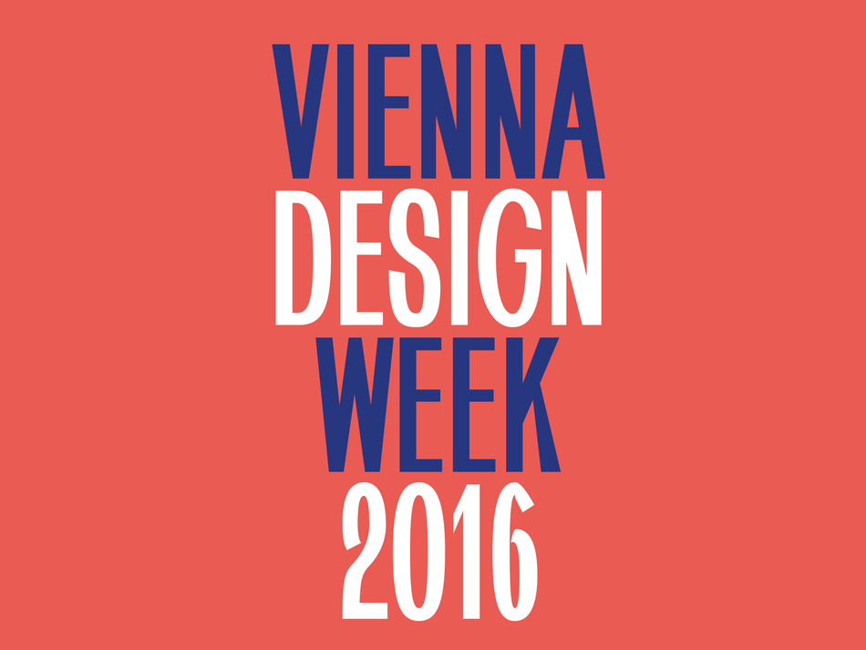
Celebrating its 10th anniversary, Vienna Design Week invited 10 Austrian designers and illustrators (including me, Constantin Demner) to work in public on an ad-hoc magazine as part of their event Open Office. The organisation gave us a day to experience the festival. The day after, we were supposed to set up a mobile studio in the festival headquarters, allowing the visitors to witness a design process.
For my research, I decided to visit one of the exhibitors: The Wolfgang Schön Artistic Institute for Copperplate Printing. This institution, founded in 1922, is one of the last copperplate printer still operating in Austria. I had a long conversation with Mr Schon about the disappearance of this practice because of industrial production methods. I wanted my contribution to the festival’s magazine to be based on the subjects raised: the loss of craftsmanship due to a lack of time and the industrial production processes.
Create a font in just a little bit more than 24 hours
Having already released experimental typefaces in the past, and knowing the significant added value of these fonts for my design studio, I have seen in this project an opportunity to create a custom font. This would allow my contribution to have a life after the festival where a regular contribution would not have.
I had Prototypo in my toolset for a while so the decision to attempt the impossible appeared obvious to me: create a font in just a little bit more than 24 hours!
Materialise an idea in Prototypo
Even though Prototypo is a relatively young product and its functions seem to be limited at times, the application is expanding quickly, incorporating user feedback frequently (Constantin wrote his post before the release of Prototypo v2, read the blog post for more info). At that time, I could choose between three fonts to start my project and I decided to work with Prototypo Grotesk.
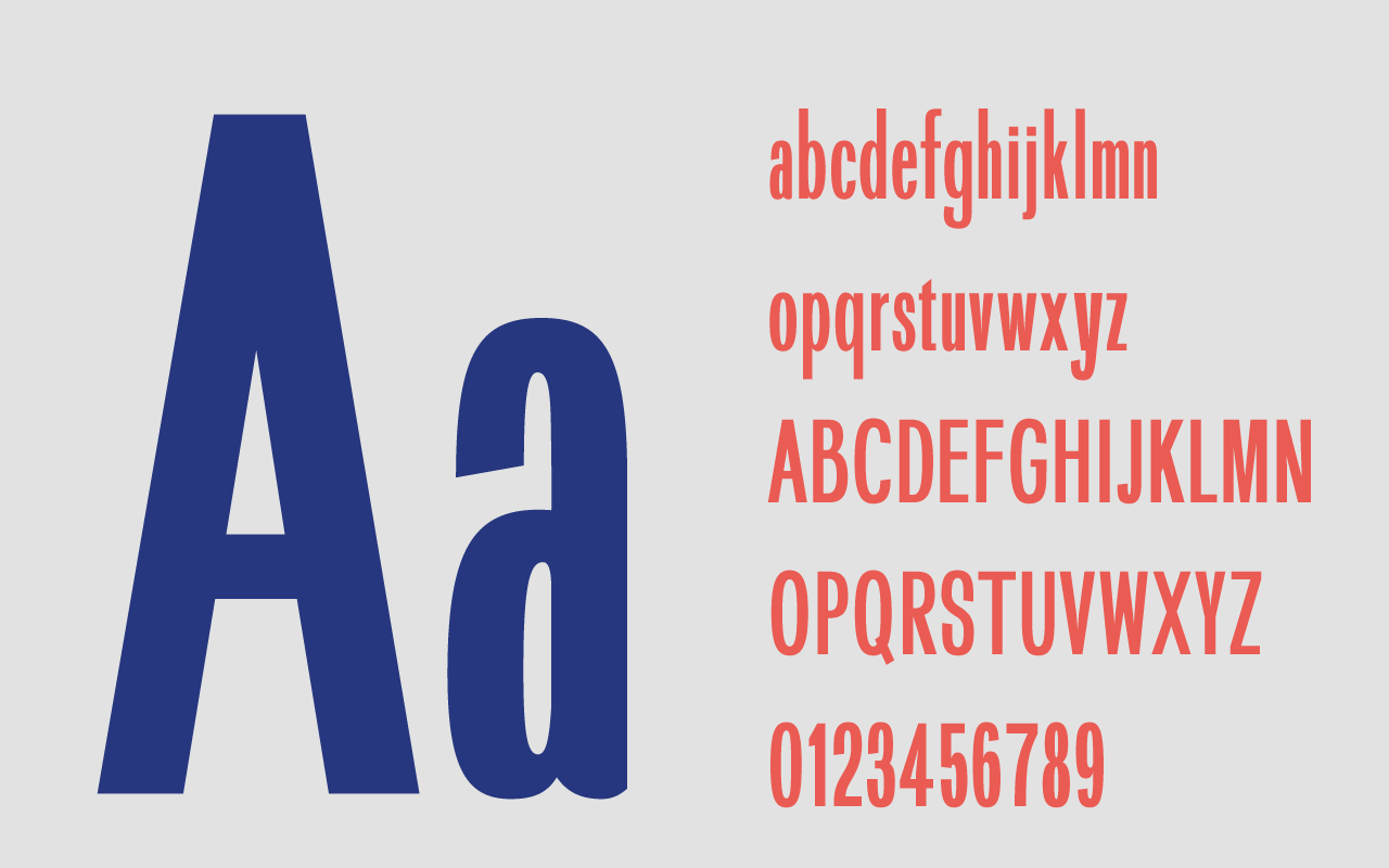
My idea was to create a display font, the readability and the flow weren’t fundamental issues. I wanted the font to contain references to my hometown, Vienna. It had to be bold and elegant at the same time, not too serious, with historic and vintage elements. I wanted it to appear refined but with an obvious amount of vernacular.
First, I worked on modifying the parameters in Prototypo until I get something close to the characteristics expected.
Once I was satisfied by the rough look and feel, I exported my font in .otf (OpenType Font) format in order to refine it in Glyphs Mini, a font editor.
I started to modify some glyphs and diacritics that needed a more detailed work. Then I used Glyph Mini for some adjustments and Illustrator for the others. (With Prototypo v2, users can now manually modify each glyphs, allowing them to perform a more detailed work before the export)
Identify my priorities
I knew my time was counted, so I tried to find a balance between tweaking as many elements as possible and leaving some dodgy and rough (lowercase “y” and ampersand are for example still weird!). I tried to adjust the kerning and the leading as good as I could, but again, restricted time meant that this couldn’t be perfect (it helps to manually kern the font or at least to use optical metrics in Adobe CS).
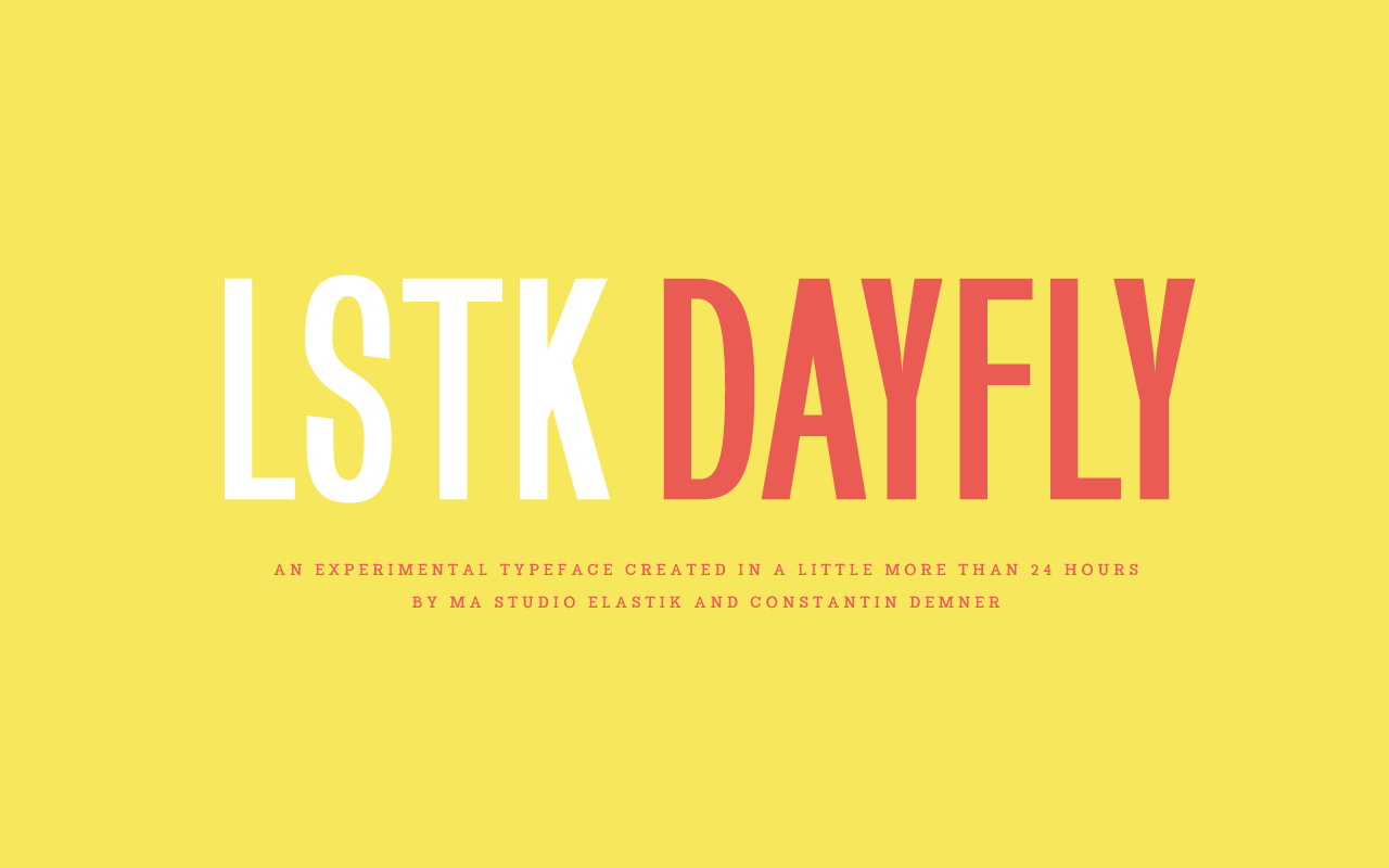
I named the font LSTK Dayfly. All the fonts I have released have the prefix LSTK which is the abbreviation of Studioelastik.com.
“Dayfly” fitted the project as in addition to being the name of an insect that has a life expectancy of a day, it’s also a word describing the phenomenon of a “one hit wonder”.
It is important for me to say that the creation of good typefaces uses to take months, even years. It is a very fine and complicated work process that requires talent, discipline and a huge amount of patience, just like any craft does.
Every type-designer deserves my deepest respect. I’m a graphic designer who created a font in 24h with all the mistakes that this implies. I didn’t mean to minimise the work of the type designers who are investing so much of their time to work on something that most people take for granted.
Exploring the rules of type design
My main aim was to explore the rules and the limits imposed in type design.
That allowed me to broach the question of the quality of a work produced in such a short timespan. Would it be good enough to be used or would it only be a draft?
While a part of me thinks that it’s possible to get amazing results, even with limited resources, I remain a die-hard perfectionist that is not easily satisfied.
Anyway, I’m eager to see the typeface in use and see what people can create with it.
I’m really looking forward to get feedback from anyone working with it! You can reach me out at hello@studioelastik.com.
You can download LSTK Dayfly Prototype and LSTK Dayfly v2 on Constantin's website.
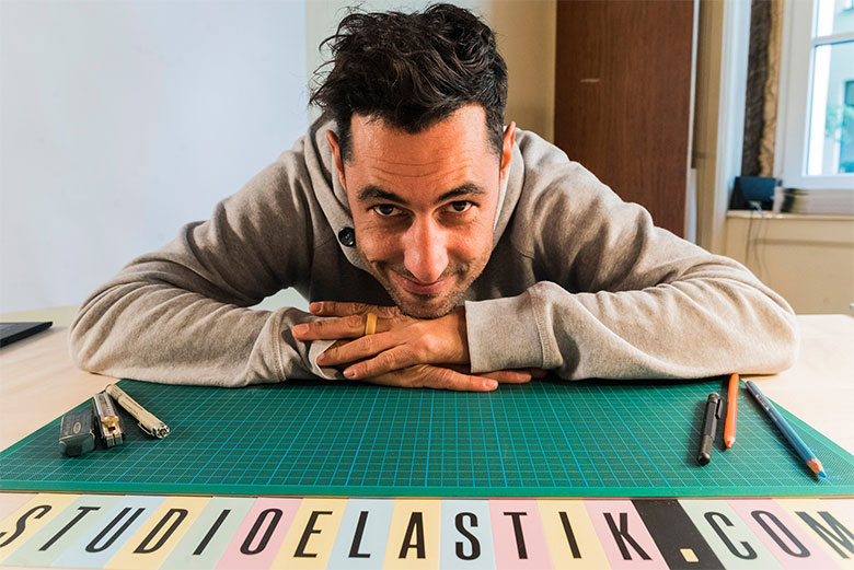
Constantin Demner, MA studioelastik.com hello@studioelastik.com
Dayfly V.2.0!
As mentioned before, Prototypo v2 wasn’t released at the time Constantin wrote those lines. We set ourselves the challenge to reshape LSTK Dayfly in a couple of hours, mainly using the Manual Editing feature on the glyphs which needed a correction. Discover what we have done on the pictures below (download LSTK Dayfly v2 on Constantin’s website).