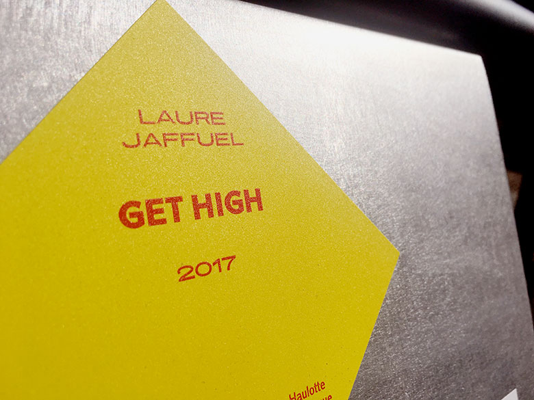
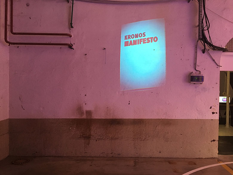
“Overview of shifting work paradigms”, G-U-I’s work for the Biennial of Design
G-U-I members tell us about their work for the 10th Biennial of Design of Saint Etienne.
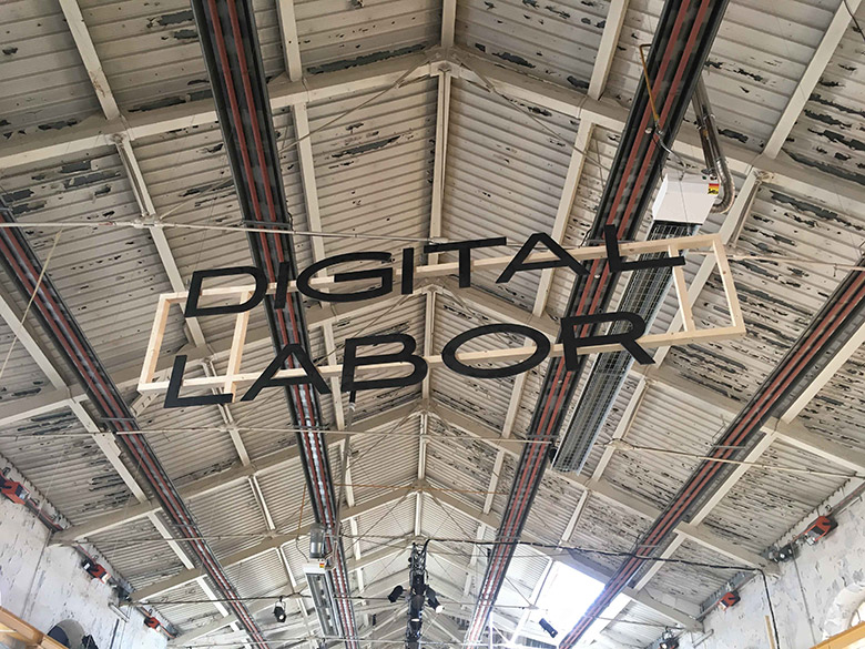
As part of the 10th Biennial of Design of Saint-Etienne (9 March to 9 April 2017), the exhibition "Overview of shifting work paradigms" took place. The curators of the Cité du Design, where the event occurred, called on the G-U-I collective for the scenography. We talked with G-U-I members about these spectacular typographic installations for which Prototypo has been useful.
Take in the architecture of the building
G-U-I's work on the scenography for the exhibition began more than a year before the event.
“The curators chose 300 items that had to be integrated to the environment. We had to take advantage of the different areas of the Cité du design. We needed to adapt to the architecture of the building, to the volumes of the rooms and their different materials.”
The first step was to carefully examine the plans of the Cité du Design.
"Someone had the architectural skills in the team, and they proved to be essential for this kind of project.”
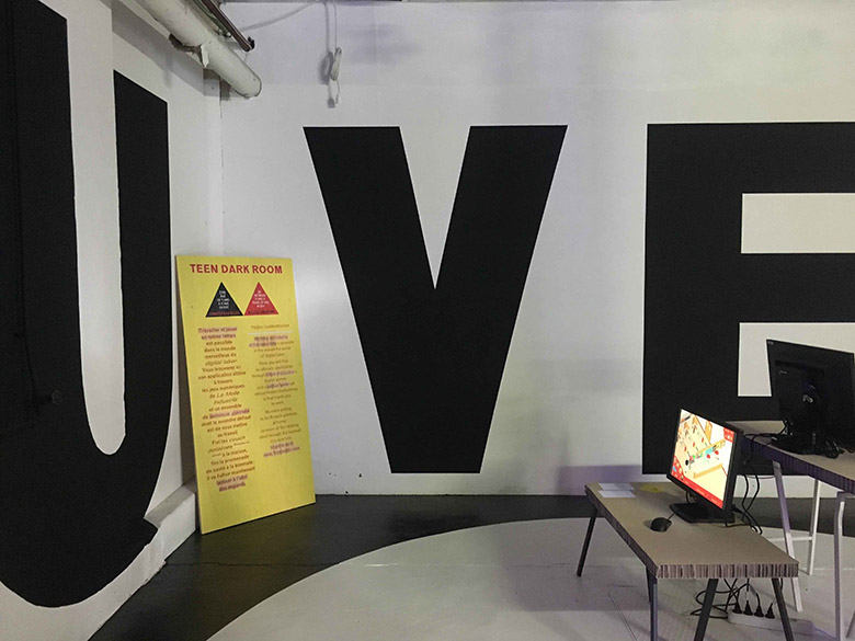
Choosing the right font is also essential in a scenography work. In the case of the "Overview of shifting work paradigms" exhibition, it had to fit many different surfaces while remaining legible.
Finding a font fitting the environment
“We initially considered working with the "Work Sans" font, but it was more a nod to its name and the biennial's theme.” (BTW: Glance at @LTypI Twitter account and you will see that sometimes typefaces are chosen for their names)
When you are working on a project including many surfaces to deal with, it is really helpful to have a basic font that you can decline at will depending on the site constraints.
“We knew Prototypo for a long time and we thought that the software could be well adapted to the context. We started from a font family, the Prototypo Grotesk, and we modified it according to the different rooms and their specificities. With the help of Céline Gay, then trainee, we exported as many variants as the spaces have required it.”
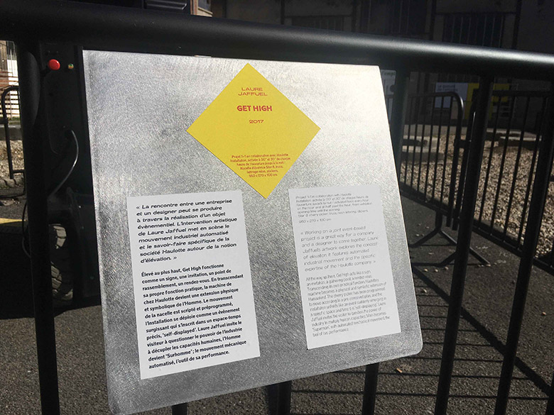
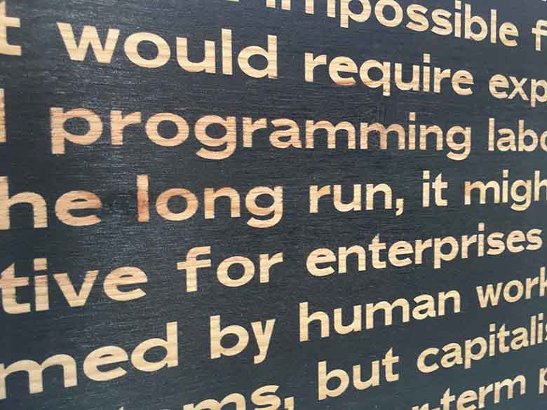
The plates alone requested several variants (bold, extended, italic, etc.). The work on this medium gave an identity to the exhibition, an identity that they declined on other spaces (sometimes more unexpected) of the Cité du design.
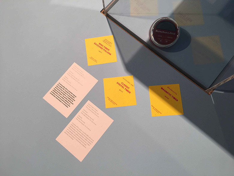
Exploiting anomalies
If you have already pushed Prototypo’s sliders to their limits (we all did it!), you may have seen some surprising things. A disproportionate X-height can make a letter unreadable on a screen or on a paper sheet, in the other hand, this "anomaly" might be useful when you want to adapt a character to a particular shape.
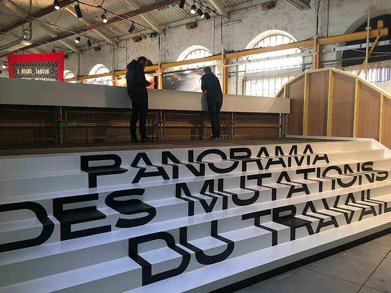
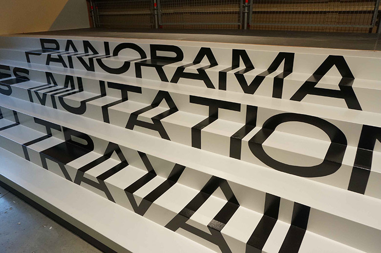
"Regarding the signage on the staircase, we had to stretch the font "uncommonly", in an excessive way, so that it can keep its legibility by adapting to the shape.”
They faced that kind of problem in many areas of the exhibition, including the "Teen Darkroom" (a set of animations created by researcher Trebor Sholz which immersed teens in the working life through video games and interactive games).
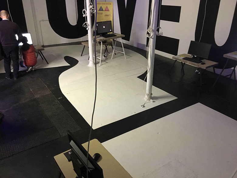
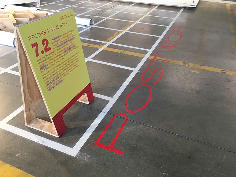
In this area, the challenge was to mark the floor and the walls, while remaining legible. Each part of the room required a different variant of the font.
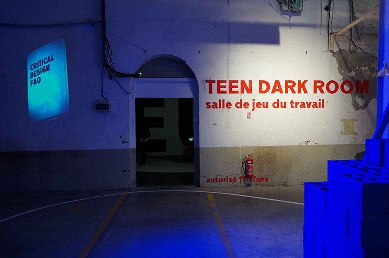
"It was essential to think about areas, the font had to fit into the available space. In addition to name the different zones, the writing had to delimit them from each other.”
Concerning the suspended letters, the aim was to create a signage integrating the particular ceilings of the Cité du design.
“We had to take advantage of the spaces, to blend into it. The work has been done taking into account all the elements of the building, the cables, the ceilings ... We tried to make the most out of these obstacles."
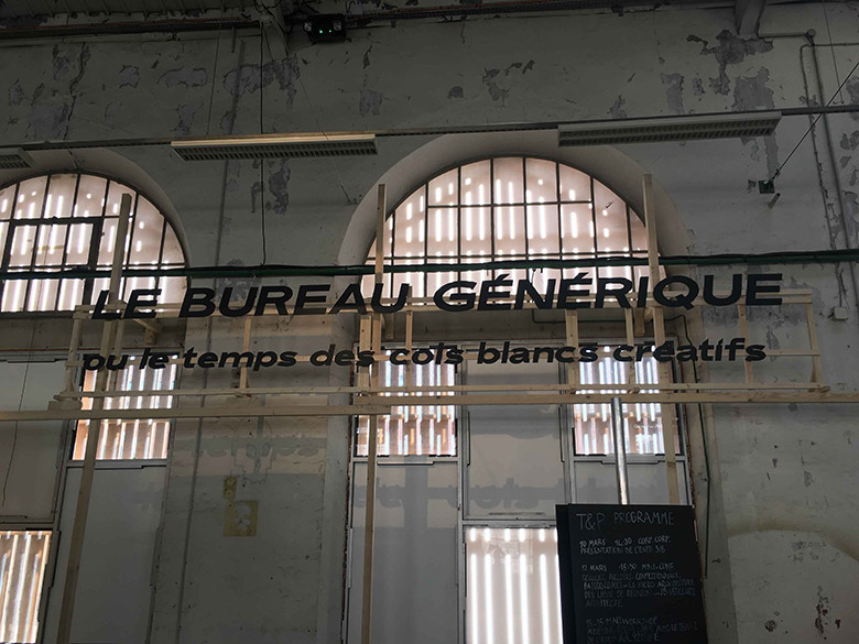
These “unusual” fonts have imposed several challenges to the painters of the Cité du Design.
“This was a particular job for them, the spacing, for example, was quite different in comparison to the other fonts that they usually paint.”
The multiplicity of formats has also led to a variety of painting and printing methods.
“Spray painting for the floors, digital print for the plates, digital die-cutting for the signs, paper printing for manifests and even printing on fabrics!”
A different approach to typography
While much of the typographic work was done with Prototypo, they used a font editor for the post-export retouches, mostly to refined the accents.
“Prototypo is a great tool to start a project, to explore creative paths. The software offers a new approach to type design. It allowed us to work in a more spontaneous way, quickly experiment new ideas.”
Prototypo allowed G-U-I to see the typography under a different light.
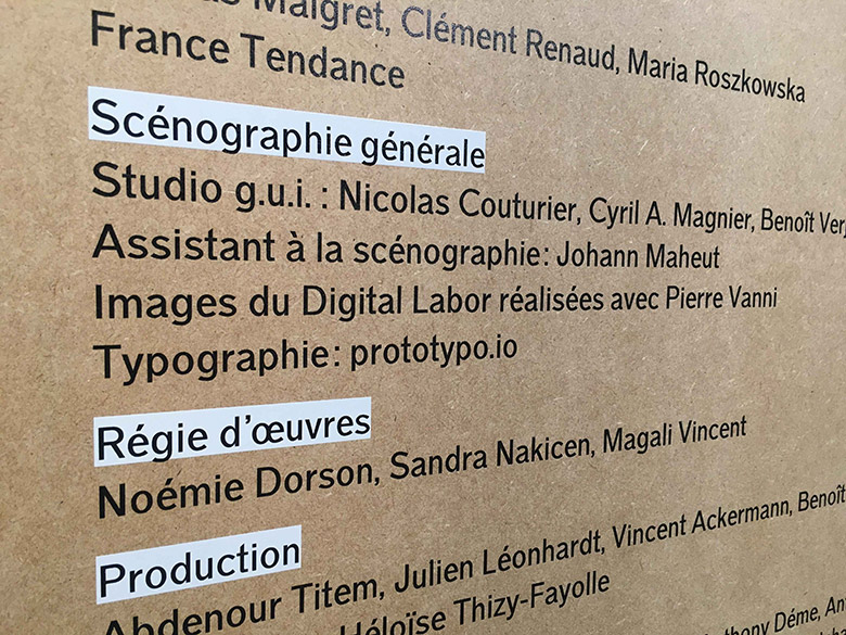
“We use to struggle with choosing the right fonts for our projects. We don’t find interesting browsing a catalog of fonts to find the one that would perfectly suit our needs. That’s why we’ll definitely use Prototypo again.”
We look forward to see what you will be able to do in the future. Keep up with the great work!
For more info on G-U-I, head to their website: www.g-u-i.net.
More details on the exhibition
Share your story on the blog
We would love to highlight your work on our blog. If you lead a creative project with the help of Prototypo, please reach to us at contact@prototypo.io, on Facebook and Twitter!
