Prototypo in the Wild: a custom font for Schema Projects
The new Schema Projects identity is an amazing example of what you can do with Prototypo! We are impressed by the work of Kiku Obata & Company who have completely understood how to use Prototypo.
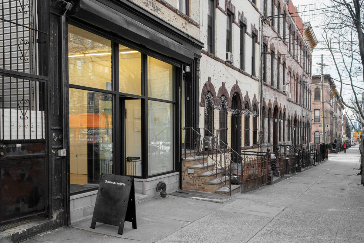
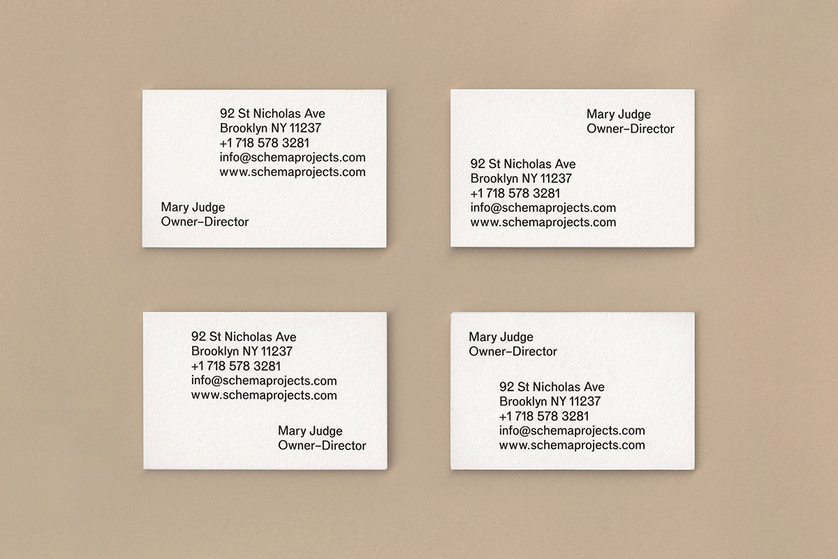
Schema Projects is a Brooklyn based gallery dedicated to works on paper. Some time ago they commisionned the studio Kiku Obata & Company to design the visual identity of the gallery. The project included a custom font intented to be used on their communication medias (exhibition cards, ads, signage, invites and totes). They got the job done with style and… Prototypo!
The challenge lay in getting a sophisticated but subtle result so that attention remains on the artists and not on the identity of the gallery. The designers started from Prototypo Grotesk to draw a custom typeface in a single weight, for the logo and to use across all materials.
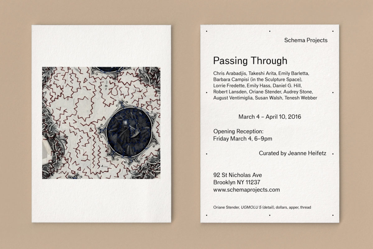
An idea + Prototypo + Some adjustments = A winning combination!
First, Kiku Obata & Company’s team had an overall idea of the final result. The following step was to set the global tone of the font by adjusting the proportions and other details in Prototypo. Then they exported the font to refine it in a classic type design software.
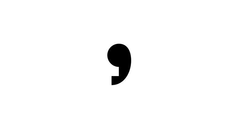
The comma especially caught our attention, because of its radical design. A small detail that counts!
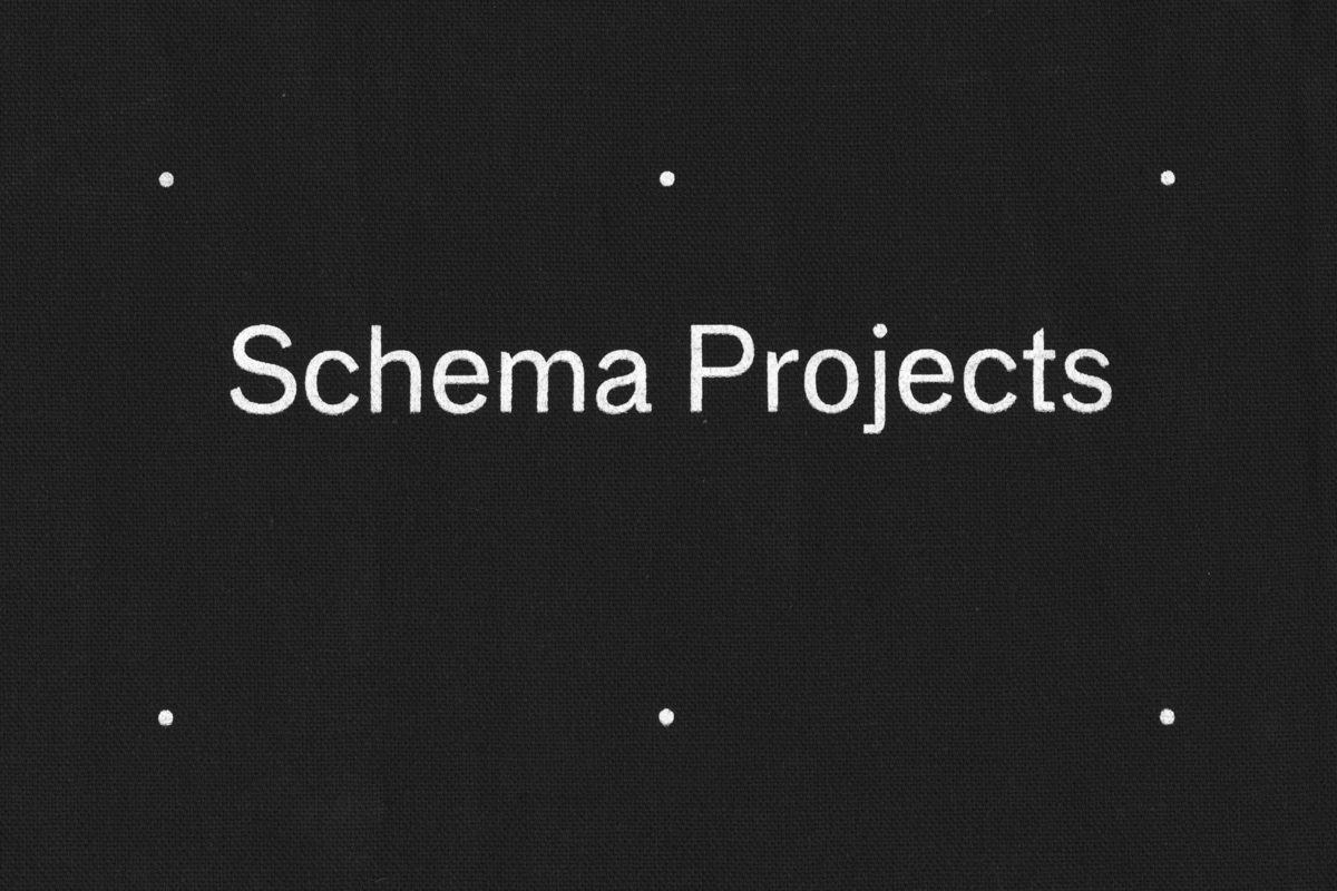
Thank you Kiku Obata for the first screen printed font from Prototypo, that’s the way we like it!

Working on a custom font project? Need some advices or just want to share it with us? Let us know, we’ll be happy to discuss it! You can find us at @prototypoApp & contact@prototypo.io.
Cheers!