“Point-Break-Point” Prototypo’s workshop at Mirage Festival
The Mirage Festival is the first event dedicated to visual arts and digital culture in Lyon. During 5 days, workshops, conferences, performances, live shows, and installations are spread throughout the city. Prototypo has been chosen by the organisation to lead a workshop focused on typograhy and type design, which took place on Thursday, March 3.
These days, every decent website is designed to adapt its layout to any device, and stay readable. Adapting the design of the fonts themselves for readability is an idea that has already been experimented (see font-to-width or TypeMedia responsive experiments). But modern browsers can provide much more information and context than just the size of the screen: they have access to the sensors embedded in your device (gps, camera, gyroscope, etc.), as well as real-time data from all over the web.
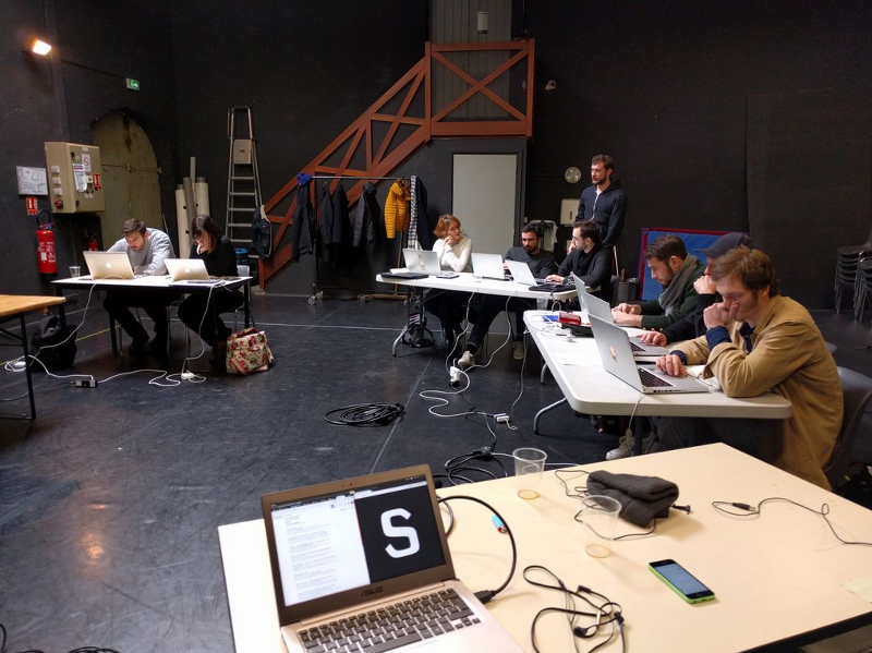
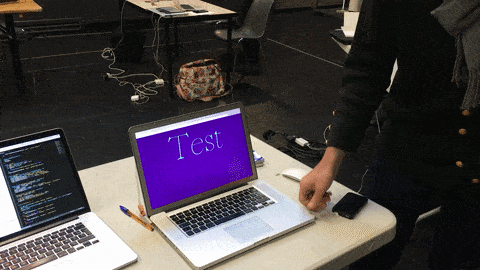
For a whole day, 7 graphic designers/webdesigners worked with us on adapting fonts to their usage, building on top of our Prototypo.js and Plumin.js libraries. We introduced the workshop with different examples and technical demo. The following letter for example, reacts the viewers’ voice and whistles: the MediaDevices API is used to connect the thickness, the contrast and the curviness of the letter to the pitch of the sound.
The participants picked the concept quickly and went on to create their own experiments. We’ve published some of them in our lab: lab.prototypo.io. Read on to to learn more about their rational and use-cases.
Here are some of the most inventive creations
With a touch of imagination and some coding skills, attendees were able to create a font that adapts itself to the background’s brightness.
##When shape meets meaning
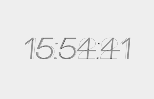
People were inspired, someone even designed a font whose thickness and size vary depending on the current time. That kind of prototype could make sense for an intelligent digital clock that sleeps during the night time with tiny numbers which grow up as the sun rise. Useless? Who’s never been annoyed by his clock with numbers that shine brightly during a sleepless night.
The participants really did consider the font as a vector of information and a starting point for new kind of data visualization. One of them built an application that displays the name of cities in different ways, depending on the wind strengh or their latitude. As you can see in the video below, the font height was linked to the proximity of a city with the equator. A smart use of font for an experimental weather widget for example.
This event enlightened us about the diversity of possibilities and perspectives that Prototypo libraries can provide to the most creative of you.
And you, what parameters available on the web would you use to influence the design of your fonts?