On the roadmap again ♪
Hello type lovers!
Few weeks have now passed since our last news about what you all expect: Prototypo and its progress!
We climbed mountains but didn’t lose sight of our goal to build a new kind of type design tool, and we have worked all summer for this!
Since the release of the dev version (available to all backers of our Kickstarter campaign), we made several updates to improve the architecture of the app and features. Most of these corrections aren’t directly visible, but they’re truly essential!
A BIG update is expected in the coming weeks, one that will interest the most creatives of you. Three months ago, we decided to rebuild Prototypo’s core entirely, to enhance the design of glyphs and bring it closer to traditional type design.
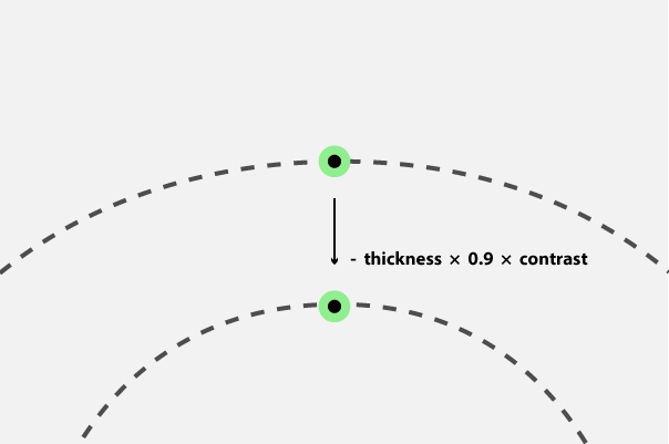
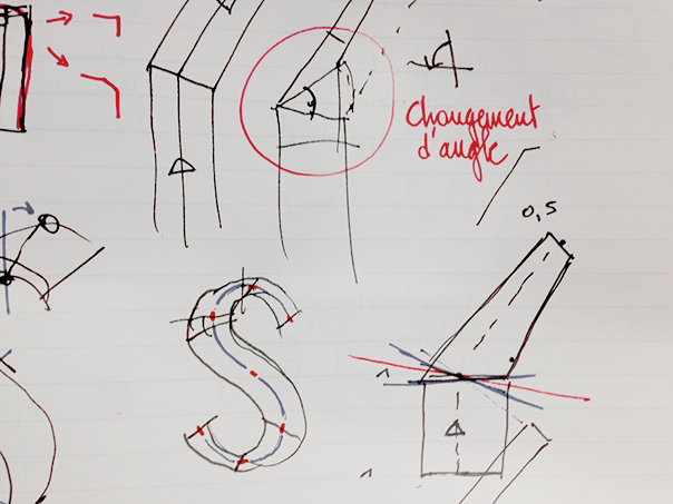
It is a long and fastidious task, so we have an obligation to take a step back for a better jump, but we believe that it will bear fruit and that Prototypo will considerably gain in quality and flexibility. In the beta version, we set up a drawing method by relationship between each point, exclusively by the contour.
This approach allowed us to quickly (figure of speech, obviously) put in place what we have currently in Prototypo. It revealed some important issues of conception though:
- The calculation of the relationship between points is sometimes complex,
- The glyph rendering is not always satisfying in the extreme,
- Modify a glyph template is a too difficult mental gymnastics, even more for a non-initiate.
You’ve understood it, this approach was easier to build the first experimentations, but have its limits and simulating the pen angle is a hard thing.
For a better design, there is the calligraphic approach, which in itself would be more logical with regard to the history of type design. However, it does not allow to reproduce all typographic shapes, and especially cross styles.
What is the right way to draw parametric glyphs?
Actually, there is no one unique way, but obviously several, and we work on the possibility to juggle between all of it when we make a letter’s template. As you will have understood, each glyph and each curve are unique and have its own constraints, and it would be absurd to homogenize the design process.
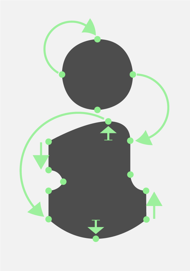
We already have a contour approach to deal with details, serifs and cross historic styles because it needs an accurate design and the possibility to manage points and offcurves independently.
A “fancy” curve can be calculated, and must be rules by tension and offcurves positioning. To achieve this, different algorythms exist and can be used:
Custom method
Two simple principles allow to draw fancy curves:
- Start and end points must be at the top of two consecutive curves,
- Offcurves follow the 1/2-2/3 rule, and therefore should be horizontal or vertical.
Obviously, this method is not efficient in all cases, and it is sometimes necessary to modify angle and positioning of offcurves.
Hobby splines
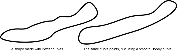
“Hobby splines were invented by John Hobby in 1985 or so, originally for Don Knuth’s much celebrated but rarely used Metafont system. They are actually ordinary cubic Béziers, but the control handles are placed not by the user but by an efficient algorithm that ensures smoothness. So of course they interoperate perfectly with software that expects to see Bézier curves, and Keynote and Pages even allow you to mix “smooth” and Bézier points in the same curve.”
All of these options are the right way to draw, that’s why we currently work on assembling it to cover all possibilities, but keeping in mind to offer the contingency to add exceptions. After all, type design is all about that: a system + a design + exceptions. A lot of micro exceptions. Yep, a lot. Really.
We want to make a next blog post about these particularities and deep constraints when you make a parametric design. Keep tuned!
When the v1 will be released?
We’re on it! Everyday, from the the early morning to late at nights… and we love it! We really would like to release an official version at the end of the year or early 2015, but what is sure it’s we do not want to rush things, because like you, we wish a functional tool and not something half-baked.
We had a lot of feedback from our early-adopters on missing features int the dev version, and it allows us to confirm your expectations about Prototypo. This beta version is very far from be perfect, but it allows us to work on a quite good basis, and test quickly new features and experiments.
We have received many words of encouragement, and some of you expect more from us: well, that’s good, so do we! The v1 will have a better glyphs design, more easily editable for the most advanced users, and a lot of new features. We look forward to have your feedback on it!
Access to the dev version + shirts
Normally, all backers who chose rewards with a tee-shirts should have received it. If not, don’t hesitate to send us an email through the kickstarter mailbox, and we will contact our provider.
Likewise with the dev version access: we sent personal keys at the end of May, but you are many to not received them. Please contact us, they’re awaiting for you!
Cheers!