Celebrating Grenoble 1968 Winter Olympics in style!
2018 marks the 50th anniversary of the Grenoble Winter Olympic Games. Let’s honor some of 1968’ stand out athletes with a series of visual creations and custom fonts!
A quick look at these 5 designs powered by custom fonts created by Luca Murat with his short comment on each.
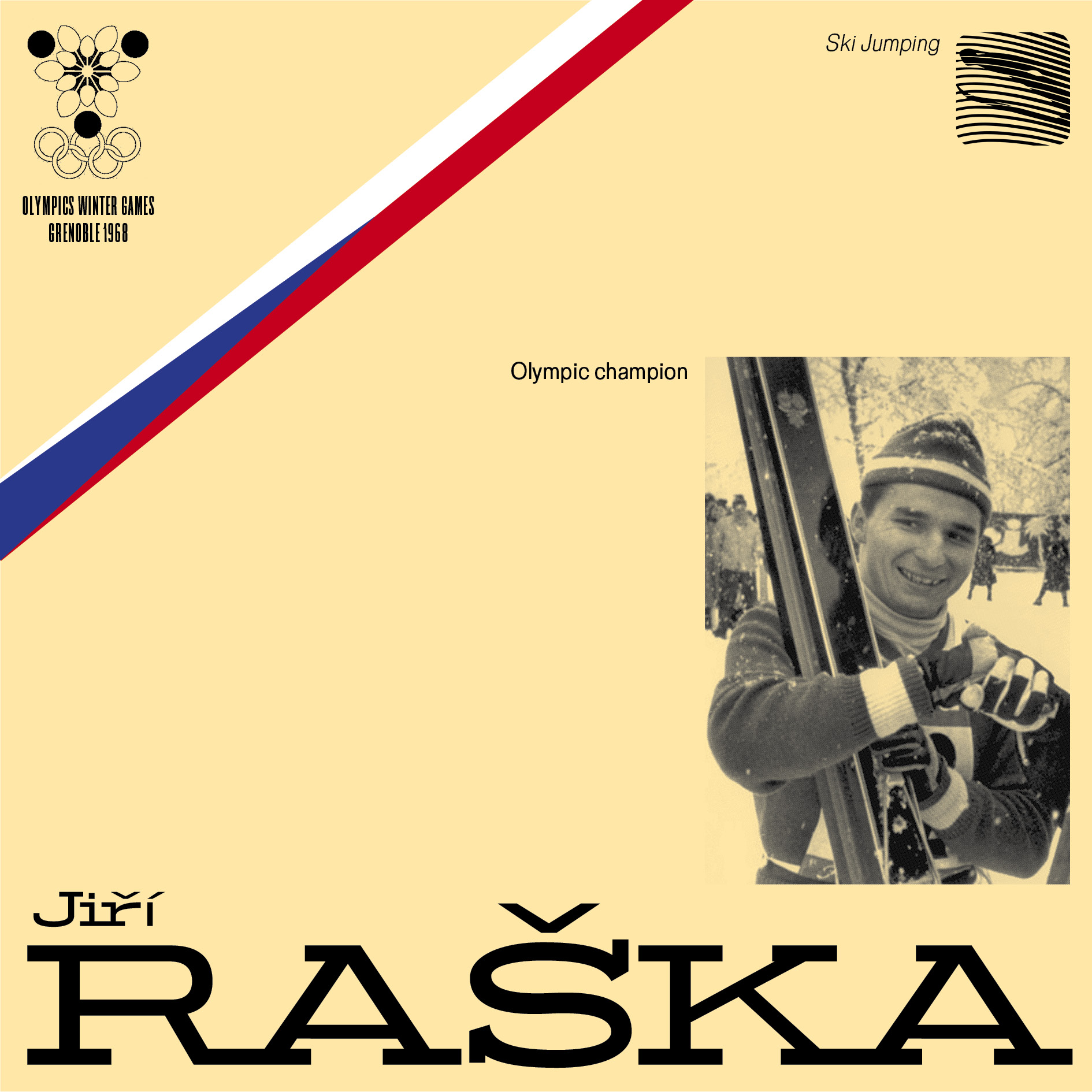
"In the same vein as the Helvetians, the idea here is to get closer to more straight forms than the basic template, the Prototypo Grotesk."
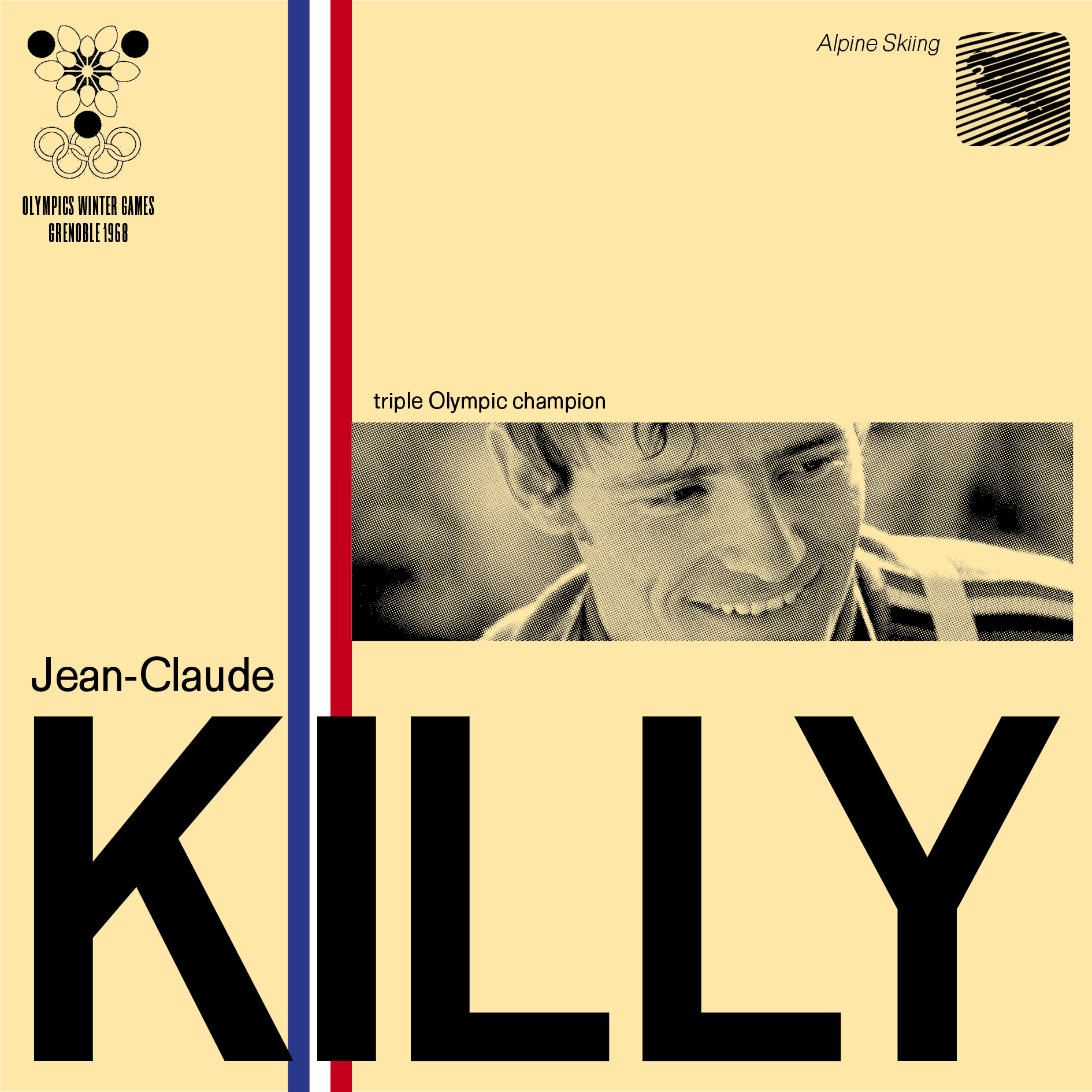
"When an Italian and an American meet you may get a surprising but interesting outcome. A Spectral visiting the Grand Canyon."
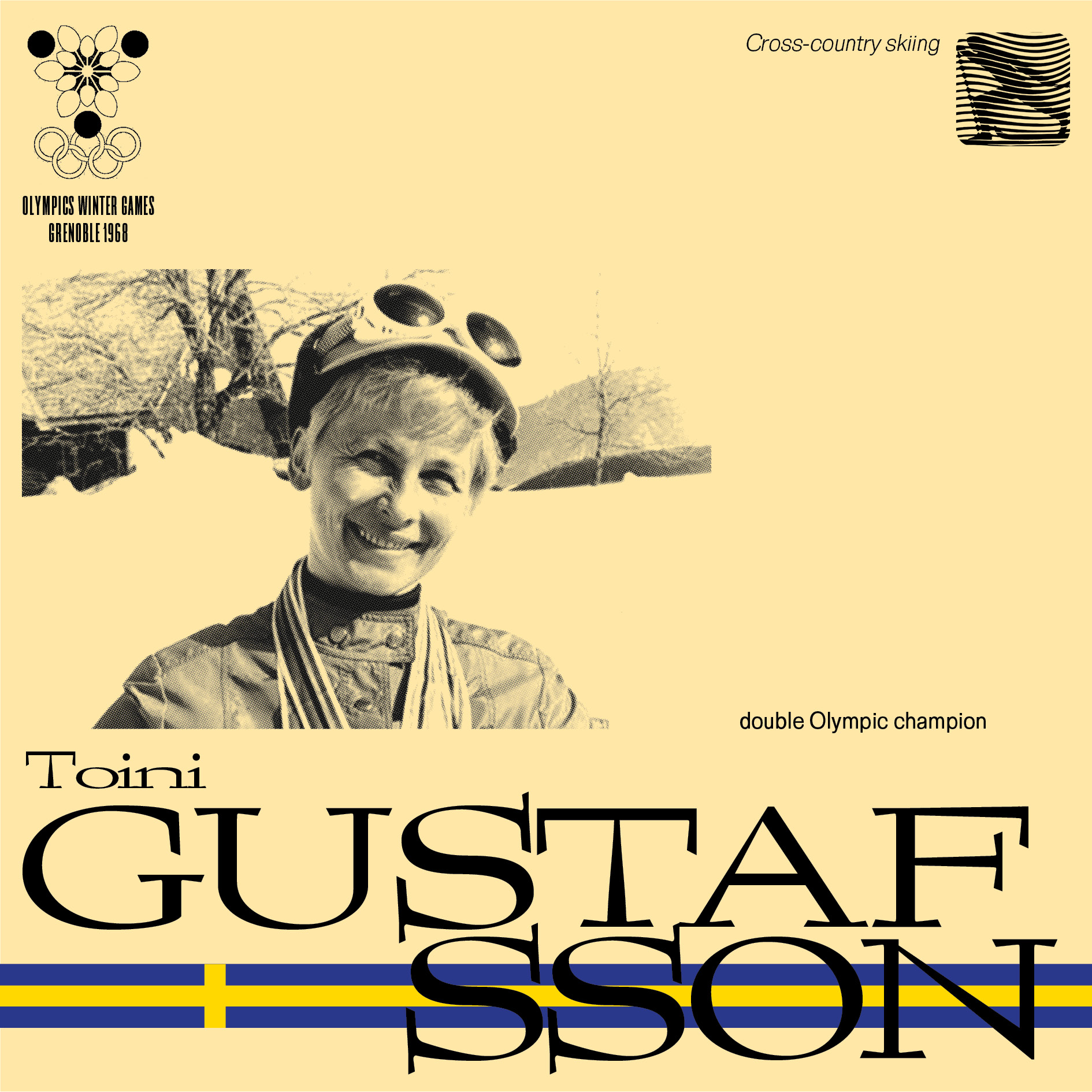
"The fulls and the untieds, sometimes turned upside down, agree here with the serifs to end up in perfect harmony. Elzevir plays with a lot of typographic rules."
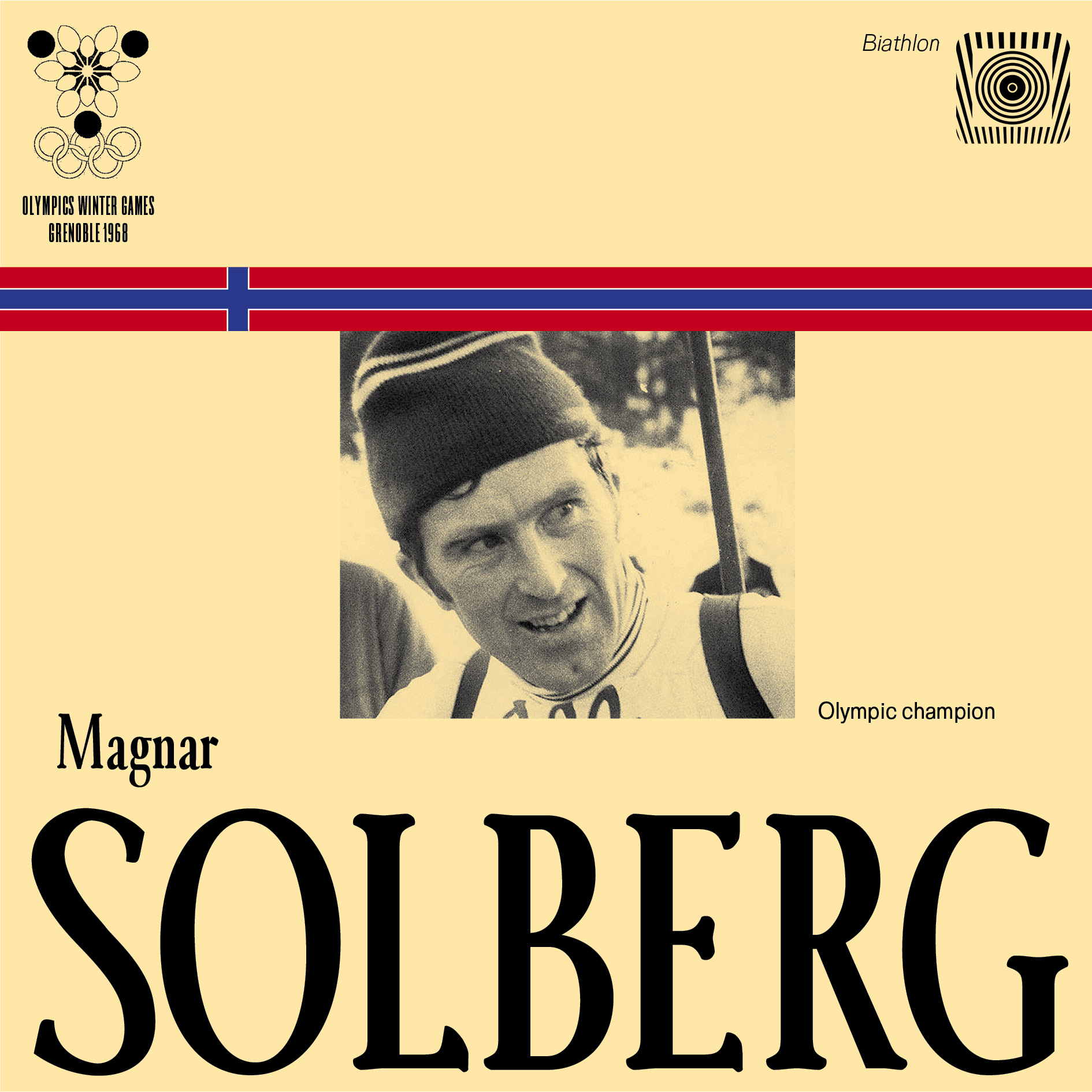
"When it comes to sticking together, Prototypo Grotesk leaves no one behind. We expand and we incorporate more prominent serifs, making connections between the letters."
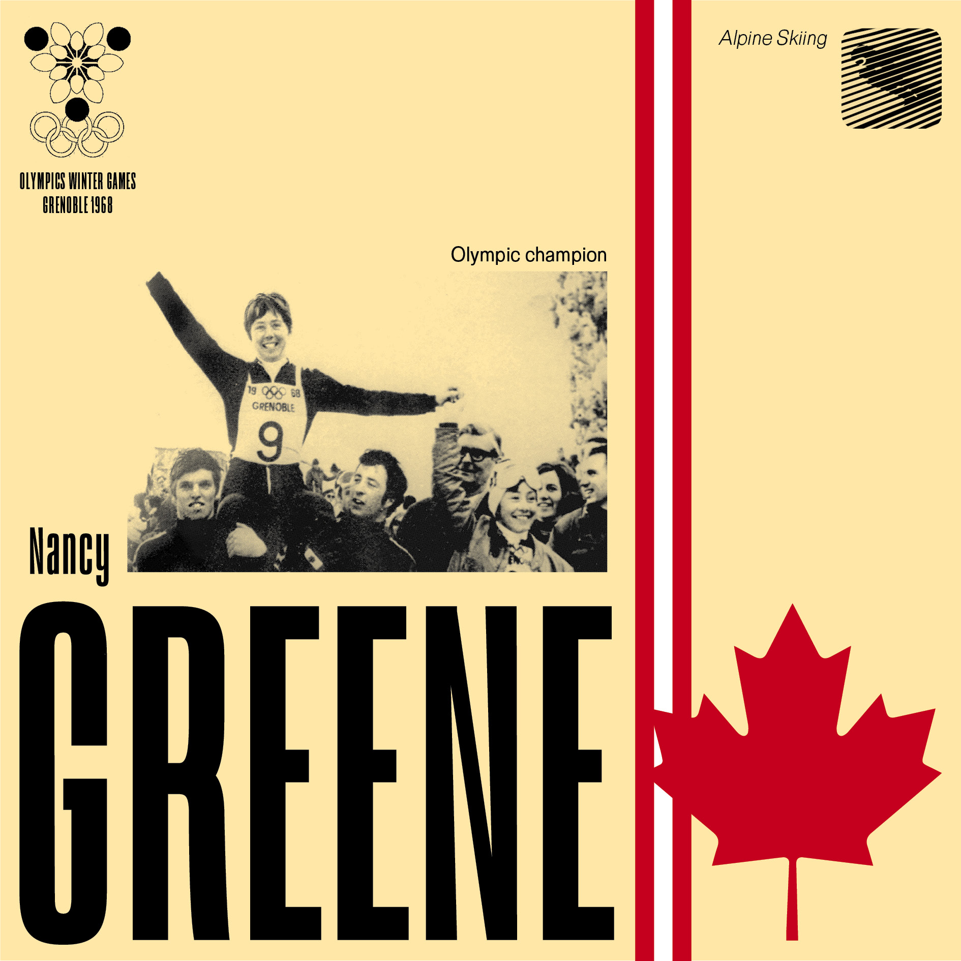
"Here we posting up a bold display font for Nancy Greene. The Antique Gothic pops out to make headlines!"
Interested in using these fonts or sharing with Luca? Reach out to us at contact@prototypo.io.
Cheers, The team.