Using components
There is a feature in Prototypo called components. What are those and how to use them? You will see that in this quick tutorial.
~ 2 min approx. reading time.
Components?
You found a template that fits your needs but it's not quite right?
How about the new Spectral template, but without serifs? Or maybe only the serifs on the left?
The components might be the right tool for you!
The components are modular blocks that can be applied to a glyph like serifs, dot or accent style.
By using the components, you can quickly add or remove shapes in a glyph, allowing you to quickly change the overall design of a template.
Where to find those
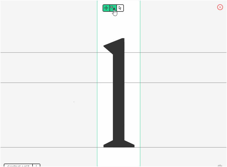
You can open the components view by clicking on the square and triangle icon on the glyph view (usually in the bottom-left corner of your screen).
Using them
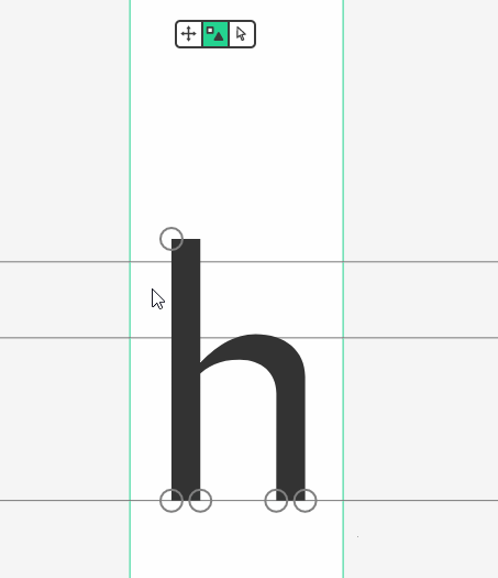
Once you open the component view, you may or may not see gray zones in some parts of the glyph.
Not all glyphs can have components. However, we are regularly adding new ones for various glyphs.
If a glyph can have components, there are two possible cases:

This glyph have a component applied at this position

This glyph can have a component applied at this position but none is currently set.
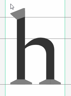
To apply or change a component, click on the component icon (the circle or the gray shape), and click on the component you want to apply on the menu that just opened.
In the future
We are planning to add new features to components:
- Manually edit the components.
- Create a group similar to the individualization group and get all component changes made on this group applied to all members.
Stay tuned for the new updates!